

“Football field” charts are commonly used to compare the results of different valuation methodologies when applied to a given asset or corporation. This article shows how to build a football field chart in Excel. It is applicable to any version of Excel from 2007 to 2016.
Steps to building a football field chart
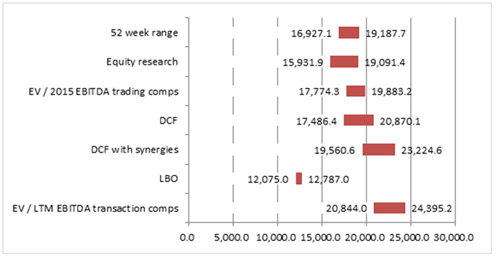
Below are the valuation ranges that we need to build the football field for and the associated valuation methodologies.
1. Organize the data
Arrange the valuation data as a table in Excel. The example below shows enterprise values, but it can be used to display share prices or any other valuation measurement.
|
Summary Table |
Min |
Max |
|
EV / LTM EBITDA Transaction Comps |
20,844.0 |
24,395.2 |
|
LBO |
12,075.0 |
12,787.0 |
|
DCF with synergies |
19,560.6 |
23,224.6 |
|
DCF |
17,486.4 |
20,870.1 |
|
EV / 2015 EBITDA trading comps |
17,774.3 |
19,883.2 |
|
Equity research |
15,931.9 |
19,091.4 |
|
52 week range |
16,927.1 |
19,187.7 |
You can copy and paste this table into Excel to use as an example. Ensure your table does not include any blank rows (if it does, delete them).
2. Create bar chart
Select the data in the table, excluding the first row (where the headers are), then select the Insert menu, select the bar charts group and click on the Clustered bar.
This procedure should have created a bar chart.
A legend will appear, either to the side of the chart or under the chart, as shown below:
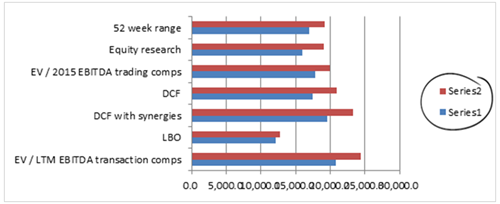
The legend must be deleted: click on it and hit the delete key. You may also want to include an appropriate title for your chart, or delete it (by clicking on it and hitting the delete key) as necessary.
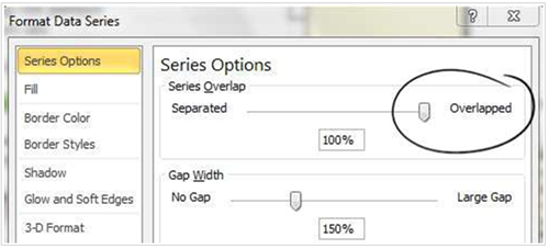
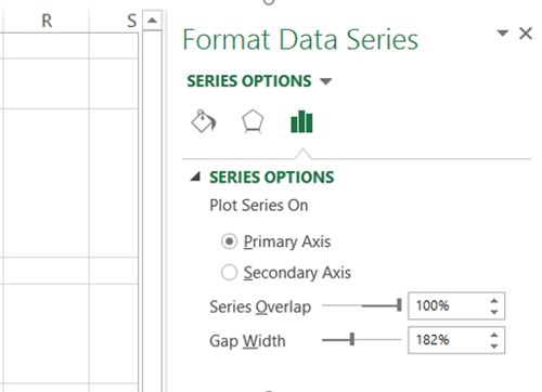
3. Format the data series
Right-click on one of the bars, which will select all of the bars of the same color (the “data series”) and select “Format Data Series”, which will open the related menu. Under “Series options”, change the “Series overlap” to 100%, as shown below:
Excel 2007 and 2010
Excel 2013 and 2016
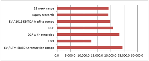
The two series should now overlap, so the chart shows only one bar for each valuation method, as in the example below:
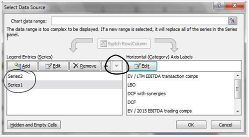
4. Stack the series
Right-click on one bar to select the series and choose “Select data”. Select “Series1” (in the pane on the left) and move it down by clicking on the down arrow, as shown below:
Your chart should look like this:
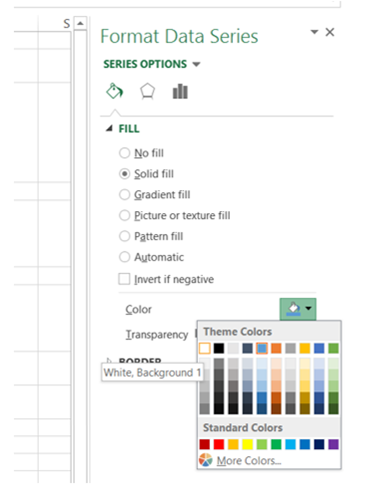
5. Hide the series
Right-click on one of the long bars (the blue bars in the example above) to select the series and choose “Format Data Series”. Select “Fill” as “Solid fill” and choose the color as “White” (to match the chart background), as shown below:
Excel 2007 and 2010
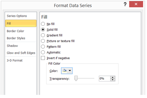
Excel 2007 and 2010
This has hidden the series, so your chart should show floating bars for each valuation methodology.
6. Add data labels
Right-click on the series colored white and select “Add Data Labels”. Right-click again on the same series and select “Format Data Labels”, then choose “Inside End” for label position. Right-click on the floating bar (the red bars in the chart above) and select “Add Data Labels”. At this stage your chart should look like this:
7. Adjust the formatting
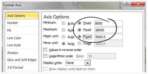
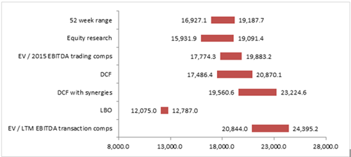
Remove the vertical gridlines by clicking on them and hitting the delete key. Right-click on the X Axis labels and select “Format Axis”. Change the parameters to adjust the value range and to make any other formatting changes as required (for example, to change the font or the number of decimals). An example is shown below:
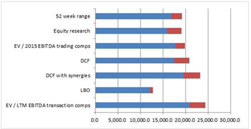
You may also want to expand the chart to the right, to stretch the valuation ranges. At this stage, your chart should look like this:
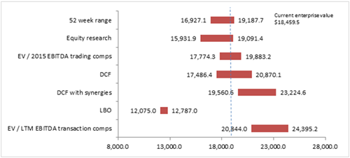
8. Add a vertical line for the current market price
Click on the Insert menu, select Shapes and then select the Line. Draw a vertical line on the chart, positioning it where relevant. If necessary, you can change the line formatting (for example, to have a dotted line or to change its color) by right-clicking the line and selecting Format Shape.
You may also want to add a text box to the chart (Insert menu, Text box) to show the current value.
9. Finished
Congratulations! Your football field chart is now ready to be used:
Please do not hesitate to contact us, if you are having trouble viewing or accessing this article.
Copyright© 2018 AMT Training