

The standard chart types available in Excel are usually sufficient for most presentational needs. However, sometimes you may need to produce presentations that combine different types of charts together, resulting in a combination chart or “combo” chart.
A specific procedure is required to produce combo charts in Excel. Simple combo charts can be created quickly, but more complex charts require special procedures. This article will take you through the creation of both a simple and a complex combo chart in Excel.
Simple Combo Charts
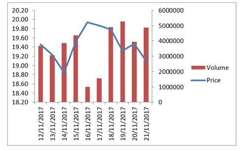
A simple example of a combo chart is a price-volume chart. In the example below, price is plotted using a line chart, whereas volume is plotted using a column chart.
Building the chart
Click here download the chart here
Excel 2010 and 2007
Follow these steps:
a) Select the entire table of data, including headers
b) Select the Insert menu and add a column chart (such as the 2-D Clustered Column). Excel should have created a column chart showing two data series (price and volume).
c) Select the chart area, go to the Layout tab (in the ribbon), click on the drop-down menu of the Chart Elements box (on the left hand-side of the ribbon) and select the Price data series. Go to the Design tab in the ribbon, select “Change Chart Type” and choose a Line chart type. You now have a combo chart, which uses columns for volume and a line for price.
d) Leaving the data series still selected, go to the Layout tab, click on the drop-down menu of the Chart Elements box, select the Volume data series and click on “Format Selection” (found under the Chart Elements box). Under “Plot Series On”, select Secondary Axis.
At this stage you should have obtained the chart shown above, which is a combination of a column chart and a line chart, each with its own axis.
Excel 2013 and 2016
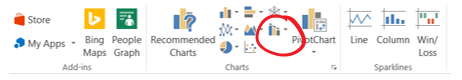
Combo charts are so popular that Microsoft added it to Excel as a separate chart type, starting from Excel 2013. To create the chart, select the data (including headers), go to Insert and select the Combo Chart icon:
You can then select from some pre-set charts, or you can customize the parameters.
Complex Combo Charts
As demonstrated above, the procedure to create a combo chart is simple. However, that procedure does not always work. For example, if you already have an existing chart, you may prefer to add the second chart into it, rather than building the combined chart from scratch. Another example is when the data for the second chart type cannot be easily amalgamated with the first chart data – as will be demonstrated below in this article.
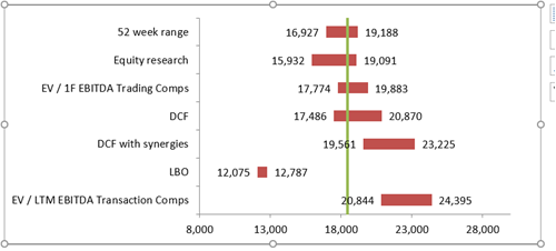
We will demonstrate how to build a complex combo chart by using a “football field” valuation chart. These charts are widely used in corporate valuation work and especially in M&A. If you are not familiar with them, we suggest you start by reading our previous article on How to build a football field chart in Excel.
Complex Combo Chart Example: A Valuation “Football Field” Chart
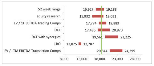
A common element in football field charts is a vertical line representing the current market price of the business being valued. Making such line dynamic (i.e. linked to an input value that tracks market prices) can be done through a combo chart.
To illustrate – the chart below includes a vertical line (in green) which is linked to an input cell currently equal to 18,459.5:
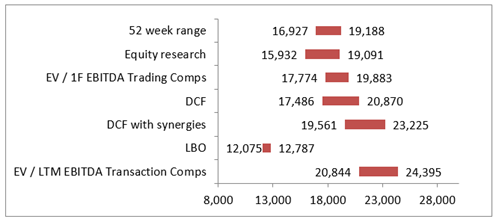
Starting with a pre-made football field chart, we will illustrate the process of adding the vertical line. Our combo chart will combine a bar chart (for the valuation ranges) and a scatter chart (for the vertical line).
1. Prepare the first chart
You can either prepare the football field chart by using the instructions in our dedicated article [link], or you can save yourself time and just download it from here.
2. Identify chart objectives and chart type
Start by deciding what your additional chart should look like. We need a vertical line corresponding to the current market value (as measured on the x axis) of the business being valued by the football field.
The football field chart uses a bar chart type, which is unsuitable to plot a vertical line. A scatter (x y) chart is well suited to produce a line.
3. Prepare data series
The scatter chart needs only two data points: the two dots marking the start and end points of the line. The data we need is:
|
|
x |
y |
|
Top dot |
18,459.5 |
7 |
|
Bottom dot |
18,459.5 |
0 |
Note that the y value of 7 is chosen by counting the number of categories in the y axis (i.e. the number of valuation methodologies shown in the chart).
4. Add the data series to the first chart
Right-click on the football field chart and select “Select Data”. Click on “Add”, then input a name for the series and, more importantly, set the Series Values by linking only one of the values from your x-y data table:
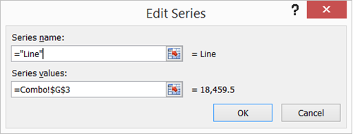
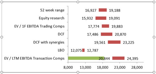
At this stage, Excel has added the additional data point into the chart. However, the chart type is still a bar, so the new data is plotted as a bar (in green below):
5. Apply the new chart type
Right-click on the newly-added green bar and select “Change Series Chart Type”.
– Excel 2013 and 2016: in the Combo chart type, assign the “Scatter with Smooth Lines” chart type to the third data series.
– Excel 2010 and 2007: From the list of chart types, select “Scatter with Smooth Lines”.
You will not see any visible result, but do not worry! Excel has taken the single data point which we added in step 4. above and has turned it into a dot. We now need to provide the scatter chart with all the data points it requires to plot the line.
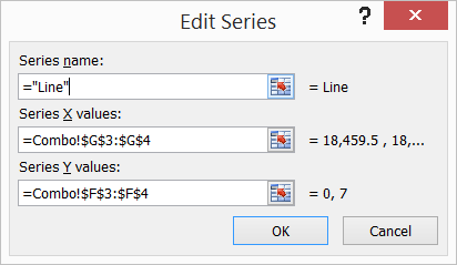
6. Complete the data series
Right-click on the football field chart and select “Select Data” (same as the beginning of step 4. above). Select the scatter chart series and press “Edit”. Provide the x and y inputs using our Excel data from step 3. above (two x values and two y values).
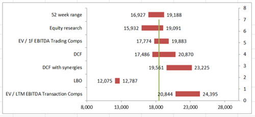
As you prepare your inputs, you should see the vertical line appearing on your chart:
7. Finalize your presentation
Some formatting adjustments are required to complete the chart.
a) Adjusting the length of the line
– Left-click on the secondary y axis to select it, then right-click on it and select “Format Axis”. Set the maximum value to a fixed value equal to the total number of y axis categories (this would be 7 in our example).
b) Hiding the secondary y axis
– Excel 2010 and 2007: Select the chart area, go to the Layout tab in the ribbon, then select Axes, Secondary Vertical Axis, None.
– Excel 2013 and 2016: Select the chart area, go to the Design tab in the ribbon, select Add Chart Element (first item from the left) then select Axes, Secondary Vertical.
c) Formatting the line
– Select the chart and select the Layout tab (Excel 2010 and 2010) or Format tab (Excel 2013 and 2016). Click on the drop-down menu of the Chart Elements box (first item on the left hand-side of the ribbon) and select the data series for the line.
– Click on the “Format Selection” button (found under the Chart Elements box).
– In “Marker Options”, select None.
– In “Line Color”, select the desired color (we have used green in our example).
8. Finished!
Congratulations! Your combo chart is now complete.
You can download the chart here.
You should be able to change the positioning of the vertical line very easily now, by typing a new market value in the corresponding input cells for the x values.
Please do not hesitate to contact us, if you are having trouble viewing or accessing this article.
Copyright© 2016 AMT Training